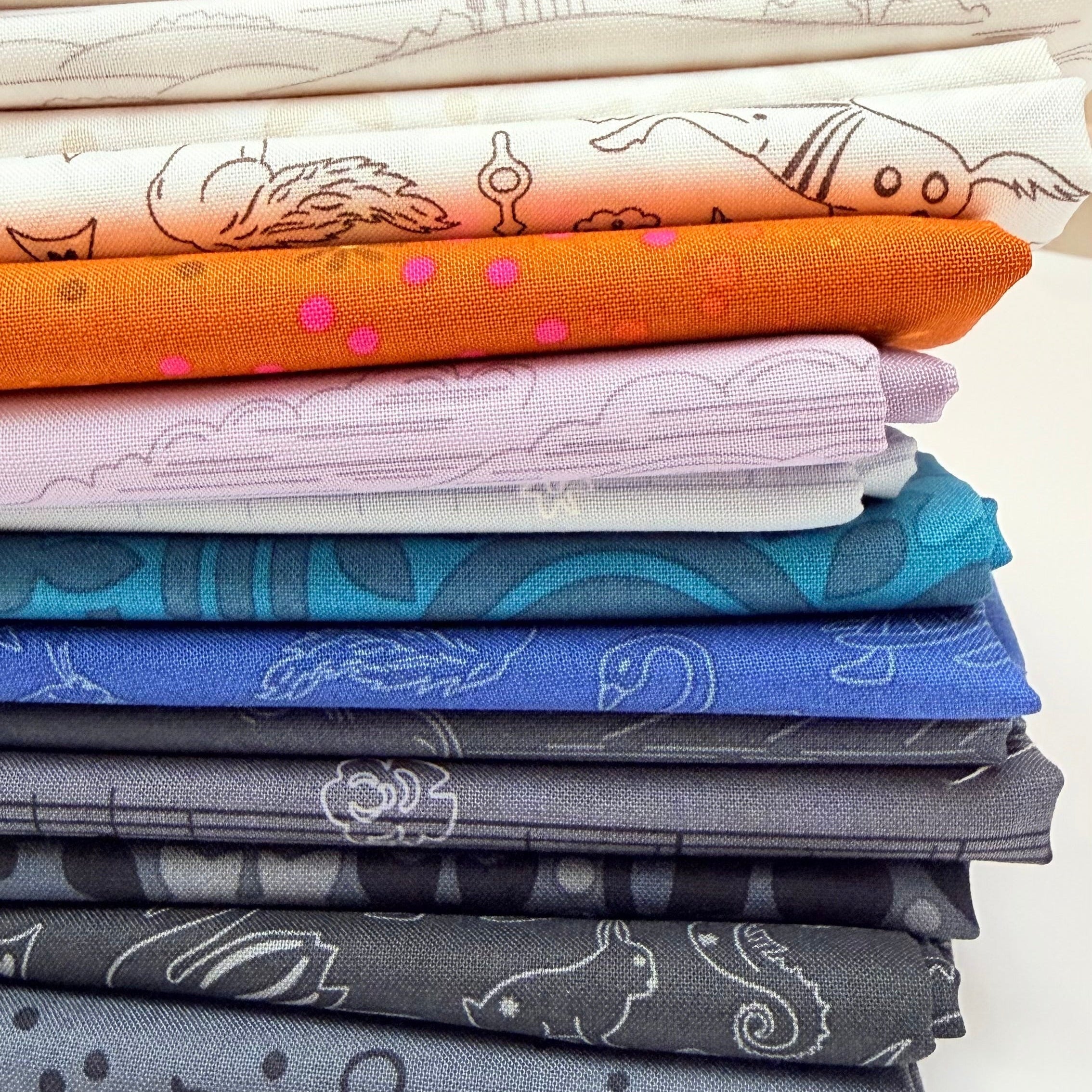
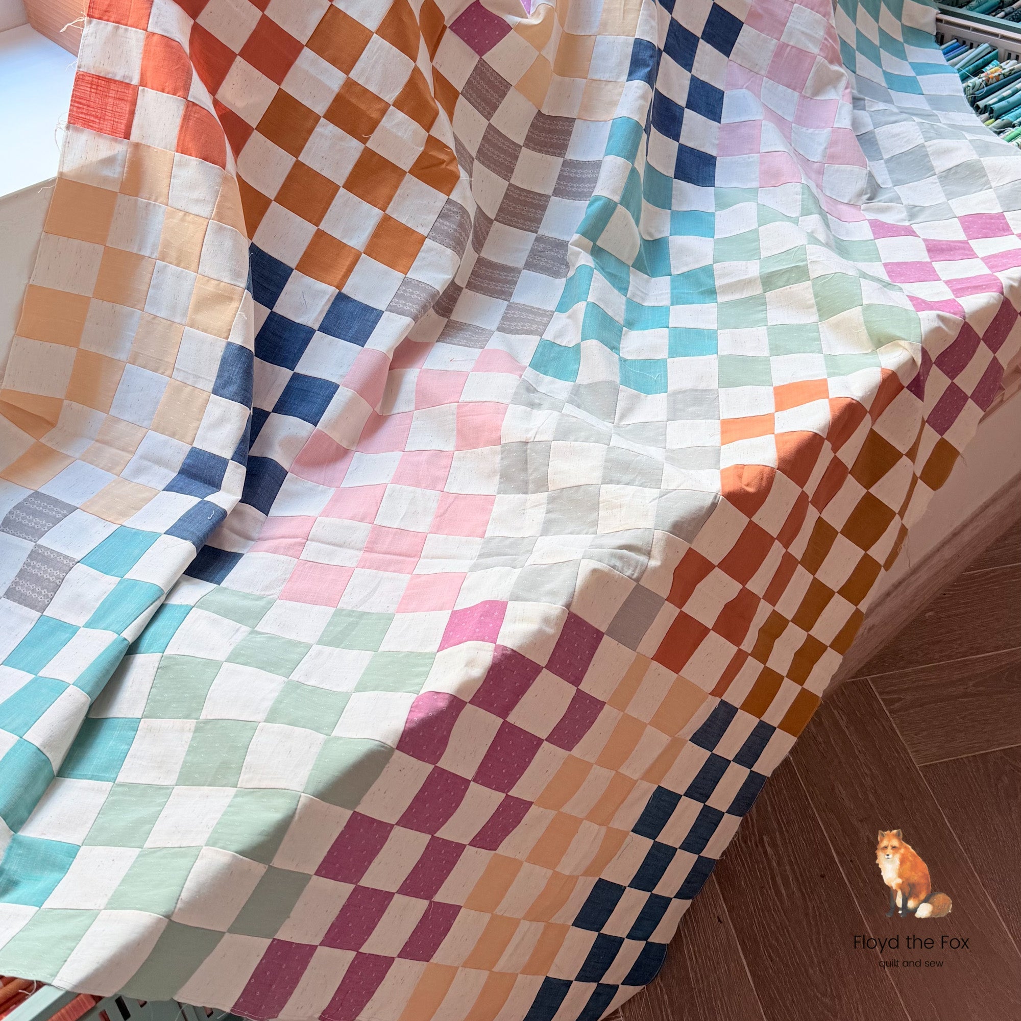
You're sitting in front of your fabric shelf. You pull out one stack after another. You lay combinations on the table, push them away again, swap out a fat quarter here, a background fabric there – and in the end, you're exhausted. No clear decision. No cutting. No progress.
And then this thought comes:
Why can't I just make up my mind? Others manage it.
The truth is: It's not about your talent.
It's about a lack of structure – and psychological patterns that almost every quilter knows.
In this article, I'll show you:
- why color decisions are so difficult
- which cognitive biases are blocking you
- a concrete method to achieve a clear color selection in 30 minutes
- and how to get from fabric chaos to finished quilts
Why Color Choice Is So Emotional
Colors are not just aesthetic. They are identity.
When you choose a color combination, you decide:
- Who am I as a quilter?
- Does my quilt look modern or playful?
- Am I brave enough?
- Is it "good enough" to be shown?
This isn't a technical problem.
This is self-image.
Added to this are typical internal drivers:
- Perfectionism: "If I choose wrong now, the whole quilt will be ruined."
- Pressure to compare: "Everything looks more harmonious on Instagram."
- Fear of loss: "What if I need exactly this fabric for something better later?"
- Guilt Loop: "I already have so much fabric. I shouldn't cut anything wrong."
No wonder your brain switches to procrastination.
The real problem: Too many options, no guardrails
Most quilters own a lot of fabrics. A lot.
What's missing isn't taste.
What's missing is a decision framework.
Without structure, every combination feels equally important. Every possibility has to be checked. This leads to decision fatigue.
So you don't need better intuition.
You need a system.
The 30-Minute Color Decision Method
This method doesn't force you to be "more creative."
It reduces options until your brain can think clearly again.
Step 1: Determine the function first, not the color (5 minutes)
Answer in writing:
- Who is the quilt for?
- In which room will it be used?
- Should it appear calming, vibrant, or high-contrast?
Example:
Baby quilt for a bright nursery → soft, friendly, calm.
This automatically excludes neon contrasts.
You unconsciously reduce 70% of your fabrics.
Step 2: Choose ONE leading fabric (10 minutes)
Not five. Not three.
One.
This fabric determines:
- Temperature (warm/cool)
- Contrast
- Style (modern, romantic, graphic)
Everything else is subordinate.
Many make the mistake of incorporating several favorite fabrics at once.
This creates competition instead of harmony.
Mini-exercise:
Place three possible leading fabrics on the table.
Photograph them individually in daylight.
Which one feels the clearest – not the most spectacular?
Make your decision.
Step 3: Build with 60-30-10 rule (10 minutes)
A simple ratio:
- 60% calm base (background / low volume)
- 30% main color
- 10% accent
This gives your quilt visual stability.
Example:
- 60% off-white
- 30% sage green
- 10% warm rust red
If you have more than three dominant colors, visual unrest occurs – and your brain immediately senses it.
Step 4: Contrast Test (5 minutes)
Photograph your selection and turn the image to black and white.
Ask yourself:
- Are the brightness values clearly distinguishable?
- Or does everything blur into a mid-gray?
If everything is equally bright, structure is missing.
Not color. Maintain the basic structure and replace with other color values.
If you want to learn more about this, I recommend Steffi @quiltwerke's on-demand course "Value Play".
Why you keep changing your mind
Perhaps you know this feeling:
You've made a selection.
The next day, you doubt it.
On the third day, you start all over again.
This is due to a fallacy:
You believe that more optimization automatically leads to a better quilt.
In reality, the following happens:
The longer you search, the higher your standards become.
And with it, the fear of not being perfect.
That's why good color choice needs a time limit.
Not more fabrics, not more inspiration, but a stopwatch.
The Fabric Shelf Reality Check
Many quilters say:
"I don't have anything suitable."
Usually that means:
"I have too many individual fabrics, but no well-thought-out combinations."
Individual purchases feel good.
Finished combinations feel secure.
This is no coincidence. Our brains love pre-decided systems because they reduce risk.
That's why clearly curated color families or coordinated fabric packs work so well:
They don't take away your creativity – they give you direction.
Mini Checklist: Is your color choice blocked?
Answer honestly:
☐ I constantly add new fabrics.
☐ I have more than 5 main colors.
☐ I change my selection daily.
☐ I'm afraid to "waste" fabric.
☐ I rarely start cutting.
If you check 3 or more boxes, you're not lacking creativity – you're lacking a decision framework.
From Color Block to Finished Quilt
A finished quilt isn't made by perfect color choice.
It's made by making decisions.
Pride doesn't come from searching.
Pride comes from finishing.
Therefore, here's a clear instruction:
- Today, determine a leading fabric.
- Build a 3-color structure.
- Check the color values in black and white mode and adjust if necessary.
- Photograph your arrangement.
- Cut tomorrow – without further changes.
You'll be surprised how much energy is freed up when you stop overthinking.
What if I'm still unsure?
Then reduce even further.
- Work with a single color family (e.g., only blues).
- Use pre-planned color schemes.
- Work with fixed quilt kits or curated fabric sets as a practice field.
Structure is not a creative cage.
Structure is creative protection.
It protects you from:
- overwhelm
- fabric purchases due to uncertainty
- started but never finished projects
Summary
If you can never decide on a color, it's not because you lack taste.
It's due to:
- too many options
- lack of structure
- perfectionism
- fear of waste
With a clear decision framework (lead fabric + 60-30-10 + contrast test + time limit), you transform chaos into clarity.
And clarity is the first step to finished quilts.
Your next step
Choose an unfinished project today.
Apply the 30-minute method.
Make a decision and get started.
Because your fabric shelf doesn't need new fabrics.
It needs finished quilts.